by Anna, Anshika, Veronica, Essy, and Liv
Our group has chosen to research and analyze data around the history of co-education within our own institutions. We’ve created a Storymap on ArcGis that compiles our various visualizations and maps our individual colleges with short blurbs on each school.
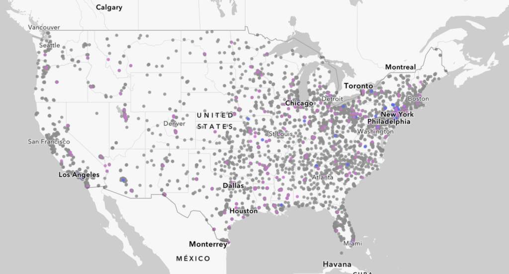
The first of our visualizations uses explanatory data to map all of the colleges in the USA, and distinguishes each by co-ed status (Co-ed, all-mens, or all-womens). Here is a screenshot of the whole map, but to interact with each point please enter through our Storymaps site.
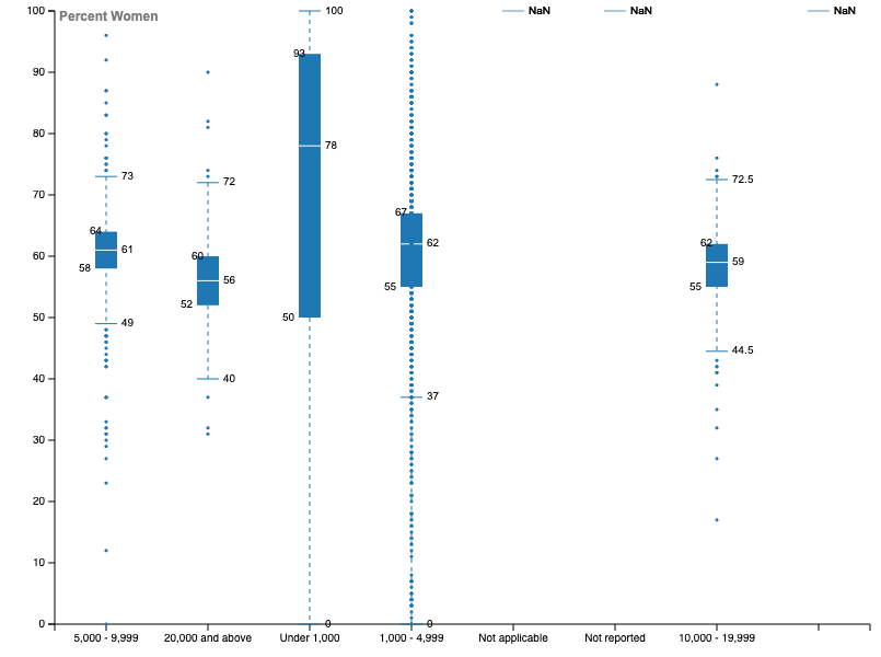
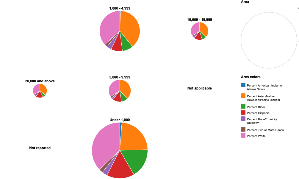
Our exploratory data, on the other hand, is shown through the box graph and pie chart below. The box graph plots data from 2020 based on the percentage of women enrolled in different sized colleges. The pie charts also look at data from 2020, displaying the varying percentages of different racial backgrounds to different sized colleges.